ChatGPT can help turn a vague decorating goal into choices worth examining, but it cannot make a fabric decision on its own. In a living-room refresh, photos of artwork and furniture led to four digital color concepts for a pair of vintage chairs. The homeowner then compared a real swatch with the room’s paintings, cushions, and other furnishings before choosing the upholstery.
Start with the chairs’ daily use
The two Lee Jofa armchairs are about 35 years old and have been reupholstered twice before. Their most recent covering was light, off-white linen with a herringbone texture. That worked when the chairs sat in a quiet office. In a busier living area shared by household members and pets, the pale fabric showed dirt and marks, especially on the rolled arms after contact with sunscreen and garden grime.
The goal was therefore both practical and visual: find a more forgiving fabric that would make the room feel warmer while working with its existing art and furniture. Protective arm covers felt too cumbersome for everyday use. A solid color also appealed because patterned pillows and throws could supply variety without committing the chairs to a large print.
Use room photos to explore color, not approve fabric
The homeowner uploaded high-resolution photos of oil paintings and key furnishings to ChatGPT and used them to generate room renderings and colorways—coordinated sets of colors for the space. The resulting chair concepts offered four directions:
| Concept | Proposed chair color |
|---|---|
| 1 | Burnished orange and gold |
| 2 | Muted coral and terracotta |
| 3 | Olive and moss |
| 4 | Old rose and paprika |
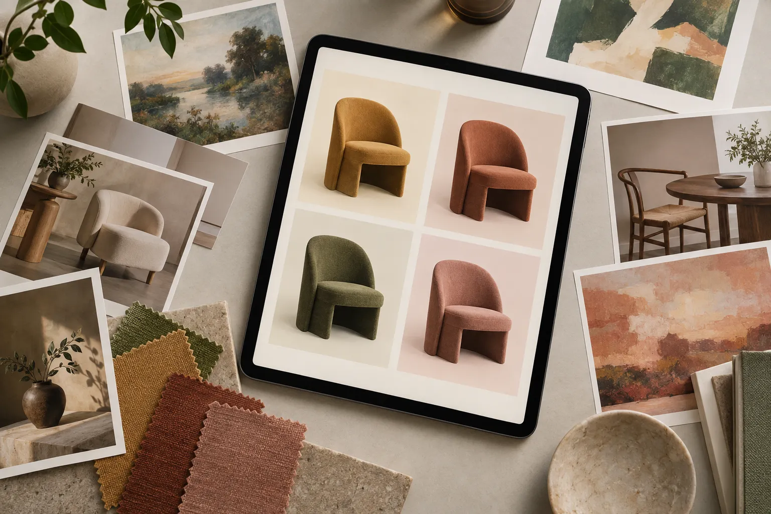
▲ Four upholstery color concepts
These concepts made it easier to consider how a change to two large chairs might affect the rest of the room. The gold option had support within the household, but the homeowner favored the muted rose-rust direction. She wanted warmth and contrast without clashing with an existing dusty blue-green settee.
The distinction matters: ChatGPT supplied possible color schemes and digital views, not a verified fabric specification or a final assessment of how the material would look in the room. Its useful role here was to narrow the field before the homeowner examined physical samples.
Check the swatch against what will stay
The selected sample was Covington Denby 318 Persimmon, a textured fabric made of 100% polyester. The homeowner called its blend of pink, terracotta, and soft rust “Autumn Rose.” She preferred natural fibers in general but judged this synthetic option better suited to chairs that see heavy daily use than the existing light linen. She also expected its mid-tone color to be more forgiving of visible dirt.
Rather than relying on the digital rendering, she carried the swatch around the room. Its color connected with the fruit and flowers in a still-life painting and details in an animal needlepoint textile. She also compared it with framed butterfly art, a seascape above the mantel, an embroidered gold cushion, patterned blue pillows, and a cream ottoman. These checks tested relationships that a single chair image could not settle: whether the rose-rust looked at home beside both warm and cool accents, and whether it offered enough contrast next to pale upholstery.
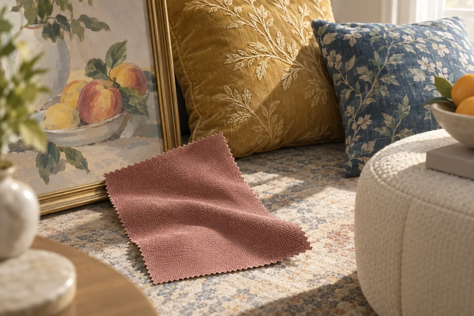
▲ A fabric swatch against room accents
A swatch can also be viewed alongside existing rugs and in the room’s changing light before fabric is ordered. In this project, the direct comparisons with art and cushions were central to the choice. Small accents, such as books in related warm colors, remained an option for carrying the new shade through the space without changing every furnishing.
Keep the purchasing decisions with people
An interior designer later examined the shortlisted swatches and agreed with the preferred rose fabric. The designer also worked out the yardage needed and recommended an upholsterer who could meet the homeowner’s schedule. Those were separate decisions from ChatGPT’s color exploration: the digital concepts did not determine how much material to buy or who would do the work.
The chairs had not yet returned from reupholstery, so the choice shows a design process rather than a long-term result for the fabric. For a similar project, start by photographing the art and furnishings that will remain, use ChatGPT to compare a few coordinated colors, and then take the leading swatches into the room. Check them against the surfaces people will see together, and confirm material needs and upholstery plans with the people doing the work.